
Submit your Harry's at Hofheimer Partnership Form
Harry’s Brand Standards
This page outlines the core brand standards for Harry’s at Hofheimer. These guidelines exist to ensure consistency across all platforms, materials, and touchpoints—from marketing and events to internal documents and partner communications.
By aligning on logos, titles, typography, capitalization, and color usage, we protect the integrity of the brand and ensure every representation of Harry’s feels intentional, cohesive, and recognizable. These standards should be followed by all team members, collaborators, and vendors when creating or approving branded materials.
Logos + Titles
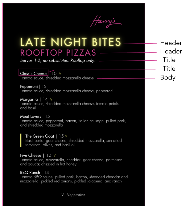
Harry’s Logo
The Harry’s logo is the primary visual identifier for the brand and should be used consistently across all marketing materials, digital platforms, signage, and internal documents. The logo should only appear in approved brand colors.
Primary Brand Name
Always use Harry’s or Harry’s at Hofheimer.
Never abbreviate as “Harry’s at Hof” or “Harry’s at the Hofheimer.”
Harry’s at Hofheimer is the primary brand and marketing focus for all communications, events, and promotions.
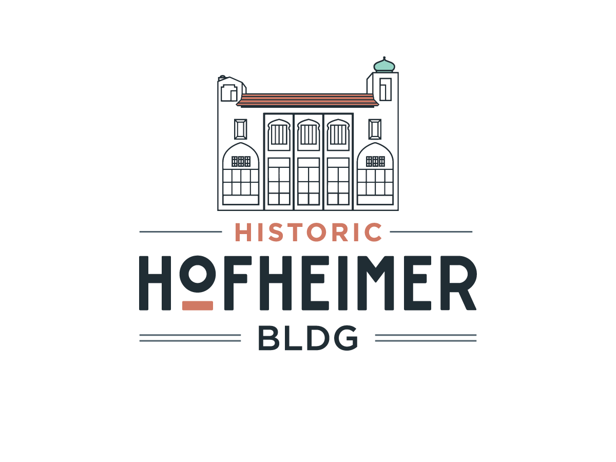
Historic Hofheimer Building Logo
The Historic Hofheimer Building logo is reserved exclusively for references to the building itself, its history, or architecture. It should not replace or compete with the Harry’s logo in marketing materials and should only be used when the building—not the restaurant—is the subject.
Building Reference
Use Historic Hofheimer Building only when referencing the building’s history, architecture, or identity as a standalone landmark. When used in marketing, it should support—not replace—the Harry’s brand narrative.
Fonts + Capitalization
Approved Fonts
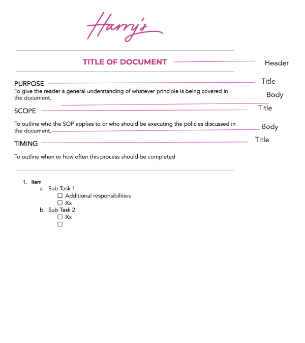
Harry’s uses clean, modern typefaces to balance historic character with contemporary design.
Futura | Canva
Header: Futura Bold / Medium
Body: Futura Regular / Light
Primary use in Canva and branded
Avenir | G-Suite
Header: 16 pt
Body: 14 pt / 12 pt
Primary use in Google Workspace documents
Colors


-
Bold and expressive. Adds personality, confidence, and a playful edge to promotions, specials, and feature moments.
-
Fresh and approachable. Used to convey openness, clarity, and a modern energy across digital and print materials.
-
Vibrant and attention-grabbing. Best used as an accent to highlight calls to action, events, or key details.